Saturday, April 30, 2005

The problem with technology in art


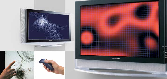
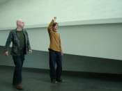
Manual Input Sessions by Golan Levin and Zachary Lieberman (I've recently written about Levin's other projects) is another one of these brilliant inventions that seem the beginning of something beautiful. We discover the technology, it is new, fresh, and has great potential. But it's not quite it yet. The video at the above link shows a study for an actual performance, that apparently is to last about 30 minutes (there is a short note about it here). Still, what we see in digital format is from a performance at the Whitney Biennial in 2004. Which means - we are to take it seriously.
The problem is - I don't. As many, many other brilliant technological inventions, it seems a tool for something else, a first step, a basis to be used elsewhere. Maybe it's because of my theater /performance background, or my appreciation of films - but I often want to include a work like this into a bigger universe. And here is my complaint: the artists whhich work in new media often develop the technology, then present it, and then abandon it, moving on to another project. The other project, of course, usually integrates the technical discoveries of the first one. But it doesn't use it in a (aesthetically, artistically...) more ambitious development. On the other hand, other artists will rarely profit from these discoveries using them as part of their projects. Question of copyright? I don't think so. There seems to be a fear (I hope I'm wrong) of staying with a given invention and working "sideways", to try and explore the various ways it can be used. Could it be that because the artists working "on the cutting edge of technology" are closer to the technological tradition than to the artistic one?
One of the objectives of this blog is to inspire. I love discovering new ways of looking at things - and then using them, consciously or not, to my own means. I am convinced that the artist should take advantage of the discoveries other artists make - and take the time to work sideways, also using other works as tools to present things in a different light

or give them a different twist

(by the way, I discovered two pretty sites about Marcel Duchamp - a simple but pretty one here and an informative one here)

I sincerely hope Golan Levin's work keeps surprizing us. Not only because his new program reacts to drawn images - but because of where it will allow him to travel. And us, to hitch-hike along.

Friday, April 29, 2005

Post-erotic art

Take a look at the picture:

Not exactly what you were expecting?
Erotic art, I suppose, has to do with subtly playing with our senses. It becomes pleasantly impossible to distinguish between erotic and aesthetic experience. One of the two guides us, the other follows us (the order of the two depends on the type of art...). Then again, we could go even further from the erotic than that. Associate anything with sex ("Doesn't that crack in the wall remind you of something?"). Our imaginations are full of erotic images, sensual associations and explicit links. But maybe it could be about not even following the links? About going the other way, "sublimating" the feelings, as Freud would say?
What are we left with, then? Conceptual boxes with no pleasure in them? Here is an example, a proof of the contrary - pleasure can come in numerous ways. Take the box.

Jack-in-the-box? Pandora's box?
Rose box. This is what it's all about: a labeled box. You can read the labels, but is that what you'll find in the box?
Start by approaching the object of your interest. What do you see? A sensual creature?


A sex object?

A goddess?


An awkward figure?


Or maybe something else?


Or maybe someone else?

How erotic is all of this? Together, it might not seem erotic in the least. But take a look at the pictures one-by-one. See how they play with curves, how they show and hide, how they tease you into believing something they don't say. Even the political one with the burka and bikini seems perversely attractive. I like them, because I can feel the tension between the sexual, and the human, and the political/social. It looks like an attempt to go beyond, but an honest one, which admits when it can't forget the stuff we're made of.

Linda Zacks's art is cool, fast, witty, pretty, funny, sad, commercial, anti-commercial, right and wrong. Zacks is a fine artist of the 21st century (I've always wanted to use this phrase). She is a designer, and a popular one. She has worked with big guns like VH1, MTV, great websites and magazines. And they seem to like her because of her talent and her tongue-in-cheek approach. She doesn't hide behind artsy talk and esoteric images, she doesn't snob herself into the art world - which would probably have gotten her out of the design world. She has strong opinions about things - some really inspiring, while others seem naive and make me sad that such a nice picture is "wasted" on such a poor statement. But at the same time that's the part I really appreciate - straightforwardness in art is a rare quality.

(via lisa's artblog)
(PS: Just don't tell me you didn't come here for the art)


Thursday, April 28, 2005

More than clear


but clarity is the lowest form of poetry, and language, like all else in our lives, is always changing. our emotions are constantly being propelled by some new face in the sky, some new rocket to the moon, some new sound in the ear, but they are the same emotions.
- Merce Cunningham (1915-), 'you have to love dancing to stick to it', Changes: Notes on CHoreography, New York: Something Else, 1968.
(quoted from The Twentieth-Century Performance Reader (link to Amazon's description))

Why painting is better than film

I remembered a quote by Luis Gispert that appeared in a post I wrote about an artist retirement fund:
"The idea of 'artist' is less sacrosanct than it once was. I could have easily gone into commercial photography or the movie business. Why should I suffer because I make art instead?"
This comment implies that making films is not art, it is business (Gispert left no other options available). The idea that movie is "just a business" while fine art is "just art" is omnipresent. On the other hand, it seems to me there are more film masterpieces than contemporary fine art masterpieces. Or maybe I'm biased, being more accustomed to works that work (i.e., are pragmatic enough to attract?) than to works that art. In this case, I don't know how to appreciate the fine cuisine of fine art since I'm too used to chosing the easy fast-food option of films. But that isn't a fair way of seeing films. And it seems to represent a silly version of the purist "art for art" thinking. Which makes the question "Why should I suffer because I make art?" easy to answer - because you believe that art is something done purely for arts sake, and seem to despise the words "commercial" and "business".

Wednesday, April 27, 2005

Software art

"Software art is empowering. Engaging. Endless. "

And in this case - unfree. As in - digital works of art for sale, at $100 a piece. Expensive? Well, the tag went down from $950. It is nice, and entertaining, and aesthetically pleasing. It irritates us, because it seems all-too-easy, when of course it is not. And then there's the way it works: the image is not only interactive, but in many cases it seems to have a life of its own. My absolute favorite of the lot is Floccus, by Golan Levin (actually, I can only speak about the free thumbnail version, as the revenue from my Google Ads hasn't crossed the $6 line yet).
At first, it seems chaotic and just faintly interesting. But if you stay on it for a while, you discover you can create entities which interact, and then influence their behavior. The graphics obey a set of rules and "try" to function accordingly.

These rules become the art. They are the essence of the experience and aesthetic direction. In traditional terms, the code represents paint or clay that the artist uses to create. It is molded, tweaked, massaged, layered until the artist is happy with the results of the executed code. The results, just as with all art, can vary drastically. The works can be simple. Complex. Abstract. Figurative. Narrative.
One of the most important distinctions is that software art is alive. It is not a video loop or static experience. It can be interactive, reactive or passive. It is typically generative, which means it can build upon itself or through your interaction.

This description is incredibly similar to that of many current perforiming art work methods: creating a set of rules you try to obey and build on. No wonder Floccus reminds me of a dance piece! Think some things by Xavier LeRoy, Teresa Von Keersmaker, or by the small but great British theater/performance group Third Angel.
I admit so far I prefer the (really) live thing. It seems - how should I put it - more intelligent. Then again, it might not be quite about the same things. In the case of software art, it seems to me like there is still a lot of room to manoeuvre - the works are interesting, but not breathtaking. Not yet? The gallerists who curated the work are enthusiastic:
It will be a standard art form in the 21st century. It's beauty and possibilities are too alluring. The artists are too talented. And the world deserves a new creative outlet.
I appreciate the enthusiasm. Makes one want to wait for more.
The works are available for thumbnail test-drives at software{ART}space
, with a statement here and the owner, the bitforms gallery, residing virtually here.
(via artnet)

(I have just discovered another, truly brilliant project by Golan Levin, called Messa di Voce)

Tuesday, April 26, 2005

The independent artist is a mediating machine

The only tactic of resisting the institutional market for the freelance artist is to become the mediating machine him/herself, producing productivity and a self-governed networking. His/her work shifts to a multiplication of activities, contacts, formats of work, collaboration and presentation, allowing for the work-in-progress character to take on almost his/her entire opus, a working without work.
- from a too savvy (and not too realistic) essay by Bojana Cvejic, at ARTmargins
(via artrift)

Botero - the metamorphosis of a painter

At my favorite conservative art blog, art-for-a-change (see this wonderful post, deeply offended by some recent performances), I discovered the new paintings of Fernando Botero, the painter famous for his fairly light-hearted, round-shaped figures, often reproducing masterpieces in his unique shapely manner.


Well, Botero's painting has changed. Dramatically.

"I, like everyone else, was shocked by the barbarity, especially because the United States is supposed to be this model of compassion." The artist was so upset about what the US had done in Iraq that he set out to create a series of paintings that would forever etch the crime upon the collective consciousness of humanity.

But Botero’s paintings are not so much inspired by the appalling photos as they are by the written descriptions of the cruelty. All of the artist’s paintings in the series are based upon actual testimonies that came out of the prison scandal, and Botero’s paintings are imbued with an unflinching and indignant moral outrage.

Fernando Botero’s Abu Ghraib series is part of a larger exhibition of 150 of his works slated to open in Rome on June 16th of this year. The show then travels to Germany, and in 2006 the exhibit is scheduled to come to the United States. Botero has said his Abu Ghraib paintings will not be included in the US show -unless museums specifically ask for them. Given that the owner of the Capobianco Gallery in San Francisco was assaulted, threatened with death, and run out of business in May of 2004 for showing a painting by Guy Colwell that also depicted US soldiers abusing prisoners at Abu Ghraib -it might be wise of Botero to exercise caution when exhibiting his masterworks in the US.
I wouldn't be as quick as the author of the aforementioned blog to call Botero's series the new Guernica (it's always a very slippery affair, comparing anyone with Picasso), but it does make a powerful impression.

There is an Associated Press article about it on this page.

Monday, April 25, 2005

Machine Love

(I am thinking of abandoning. This seems hopeless.)


The Lovers
Two networked machines, one infected with a virus, slowly infects the other through the interface of classic romantic poetry.
A breakdown in the relationship was inevitable once the virus had seeped into the memory of one machine and then into the other through a singular network cable affecting the poetic text files. Communication between the two deteriorated, leading to irrational & at times odd behaviour. Each machine reacted with equal confusion and conflict. The interface text became an illegible poetic mutation of itself.


(via Neural)

Locative Art

A person walking through the city centre hears a beep on their phone and glances at the screen. Instead of an SMS alert they see a message reading:

“We are currently experiencing difficulties tracking your position: please wave you network device in the air.”

Loca is low cost, grass roots, pervasive surveillance; an exercise in everyday tracking. What happens when it is easy for everyone to track everyone, when surveillance can be effected by consumer level technology within peer-to-peer networks without being routed through a central point?

Loca aims to lightly touch large numbers of people. The aim is not complex interaction, but subtle affect. It will be like a picture glanced at sideways, a message caught in the corner of the eye, or a mosquito swatted on the arm.

Loca deploys a cluster of interconnected Bluetooth nodes within inner city urban environments, each one is built using readily available, cheap parts, and is encased in concrete.

Loca enables anyone with any device that has Bluetooth set to discoverable to be tracked. Bluetooth is the first ‘everyday’ network technology that enables people to be tracked, and to track each other, within the physical environment.With all these technologies the only way to opt-out of surveillance is to switch off.

We are not asking people in advance. We dont want their permission. Then it would not be surveillance, but a performance by them for us. One principle of the project is that people should be able to participate through their own mobile phone without being given any additional technology, and without their own device needing to be modified in any way, either through installing software or by altering settings.

Pervasive surveillance has the potential to be both sinister and positive, at the same time. The intent is to equip people to deal with the ambiguity and find their own conclusions.

Loca is an artist-led interdisciplinary project on mobile media and surveillance by Drew Hemment, John Evans, Mika Raento and Theo Humphries.

Loca first appeared on Pixelache, the Finnish Festival of Electronic Art and Subcultures.
Drew Hemment, one of the authors, wrote an insightful essay telling the fascinating story of "Locative Arts", published here (below the text you will find a dozen addresses excellent locative art projects published on the nt). I have never expected this to be such a blooming field of art. You can also find more at locative.org, with all sorts of new and on-going projects.


Sunday, April 24, 2005

Biting reality


See two projects by photographer Matt Siber.

The first one is called Floating Logos, and I think the above picture is pretty self-explanatory.
The second has a name which at first seems innocent: The Untitled Project. Then, you see the images. And then, read the texts. And then, you get it.

Siber reminds us that artists, at least conceptual artists, view the photograph as a flat field of information rather than a window. He accomplishes this by re-posting the removed words on a blank sheet next to the expurgated original. They pop to the surface of the sheet turning it into a page. Like the painter with a blank canvass, and writer with a blank sheet, the photographer starts with an invisible idea and collects visual facts to support it.
(from the curatorial note of The Untitled Project)

Both projects have a fresh feel to them: they are smart and well-made, entertaining - yet they go beyond the pretty surface. They have a very strong conceptual side to them - but Siber doesn't forget the aesthetic part of the game. "Game" goes particularly well with The Untitled Project, as we try and fill in the spaces, guessing what goes where- and why. And then, we might think about all this information we take for granted, its quantity and quality, and maybe, just maybe, think about how to deal with it. In an entertaining, yet smart, way.

Saturday, April 23, 2005

Acting unfair: when art gets personal


there's no Getting used to Art.
changing the World is an impossibility.
In a World in wich EVerythinG Happens By chanCE, The Artist can at Best Win a Chance Victory Over chance. Every Artist/Animal For HimSelf, Like ShipwrecKed Sailors.

Jan Emiel Constant Fabre, Lyon 2001
The above words are written by Jan Fabre, theater and visual artist, during the performance Sanguis/Mantis (a book was created out of it, but it's not available in the usual internet stores), using his own blood extracted throughout the 8-hour event.
These are very powerful, scary thoughts. Every artist/animal for himself. Fabre writes this dressed in an armour created by him for this event: he is a knight turned insect, a strange, lonely creature trying to execute whatever he thought out for himself, making it difficult for himself, fighting his own weakness while underscoring it.

Is this sort of art fair?
It seems to go exactly the opposite way to what I wrote about in a previous post: here, the story is so dramatic, so full of meaning and painful narrative, it seems impossible to turn away, to consider it anything less than powerful. Do we have a choice as spectators?
This reminds me of another story, with another artist that uses his pain on stage - the dancer Bill T. Jones. Here is a description of the attack by the New Yorker's dance critic Arlene Critic against what she characterized as "victim art" (the controversy took place in 1995):
Refusing either to see or to review the production Still/Here by Bill T. Jones, one of the leading experimental and politically engaged dancers of the decade, Croce charged that as a black man and a victim of AIDS, Jones's use of autobiographical material made objective criticism impossible.
In her "anti-review", Croce asks the rhetorical question:
"If an artist paints a picture in his own blood, what does it matter if I think it's not a good picture?" Croce, (...) the most powerful dance critic in America, inevitably created a firestorm of controversy, and focused attention once again upon the conservative suspicion of contemporary autobiographically based performance, especially that created by members of racial or sexual minorities.
(quoted from Performance, a critical introduction, by Marvin Carlson, available at Amazon)

This is not as much about autobiography, as it is about showing the subject in a specific perspective, an unglorified one, or rather one that glorifies by creating a martyr. Interestingly, the word martyr originally meant "witness". Indeed, the suffering artist can be seen as a witness to a truth beyond the reality of the work of art. As spectators, we can accept it as a direct testimony to this truth (however ambiguous or esoteric this truth may be), or reject it, not as much because it isn't true, but because we feel it is a "private truth", one that hasn't got its place on the stage of an artwork.

But this mechanism goes far beyond body art or "victim art". It concerns any artist and spectator, because it is really about the role of intimacy and the non-public in the public event that is a work of art. It is about our definitions of art, form, and public space. It is about what we find important to share, and what are the possible/acceptable ways we find to do it. It can be the artist's blood on paper, or a photo of someone's cat, or a painting of a white square on a white background, but the question for me remains: does it impress me - touch me, as art. And why would it matter if it touched me as something different? Would it really be unfair? I wouldn't say so, as long as I have the possibility of saying: "Thank you for the moving performance, Mr.Fabre. Unfortunately, as a show, I found it boring."

It might seem like we are in some extremely modern, yet unchartered territory here. On the contrary. In Aristophanes' play The Frogs, considered to be the first theoretical comment about theater (405 BC), two famous playwrights, Aeschylus and Euripides, argue over who's dramatic writing is better:
Aeschylus: You wrapped [the heroes] in rags from old beggarmen's bags, to express their heroical woe, and reduce the spectator to tears of compassion.
Euripides: Well, what is the harm if I did?


Friday, April 22, 2005

Classy art/ Artsy class


Here is a small blog-game about class, by Richard Rinehart, wittily called Reading Class.
ReadingClass is what Joseph Beuys called "social sculpture"- engagement with the intangible elements that shape our lives. ReadingClass uses social software to explore the social question of class. Specifically, ReadingClass is a multimedia game built inside an Internet blog; a blog being a set of standards and software used for online personal journals or conversation.

(...) if ReadingClass seems at times didactic; it is unapologetically so. ReadingClass strives to be journal and discussion forum - a cultural engine for revealing, exploring and critiquing social class.
The element of the game itself that I found really interesting is called Display, and here is a fragment of its description:
Stories seem very important to the lowest and highest classes. Lower class homes often display representation of family members (photos) or artistic productions of family members (junior's clay pot, etc). The homes of rich people I've been in rarely display family portraits, painted or otherwise despite the stereotype, but the stories remain, only now they are attached to photos and objets d'art obtained on trips abroad or from galleries. An object on display is worth only half it's potential class value if it is not accompanied by some sort of interesting story that is personally relevant to the owner. With display, the middle class is the odd man out. In their insecure efforts to achieve or hang onto their class status, they sometimes display objects or images that have no real relevance to their own lives, but rather to the lives they aspire to.
In my opinion this "class caracteristic" is really a question of what are the things important for you (to put it more dramatically: what are your values). The people who need a story behind the object want an insight into the world. Those who only need a kind-of-nice-picture seemingly have no need for that insight. Maybe they'd rather go off zapping to another channel, or their aesthetic needs are not so closely related to their need for narrative (there is a great contemporary philosopher, Charles Taylor -here are some of his books - , who talks a lot about the need for narrative and for values). What's even more interesting is that contemporary artists, too, could be analysed among these lines. And the distinction would not be between the "abstract" and "figurative" artists, but rather, between those who associate their work with some narrative(s) and those who don't feel the work needs a story. My personal affinities lie closer to the first group, but I can see where the second comes from. The bottom line is: can't one appreciate something for just being beautiful? Do we really always need more?

(via Rhizome.org)

Thursday, April 21, 2005

More dada, andada, andada

If you think dada netart makes sense and is a never-drying creek of creativity, check out Grafik Dynamo.
Here, the pictures are chosen from the net at random, and then combine with texts (randomly chosen, of course) from a comic book.

Personally, I am now getting a little tired of all these "chance operations" and the supposedely wonderful things I am to arrive at while looking at accidents. Hazard is a dangerous things - it makes you believe in luck, and makes you associate luck with meaning, with sense, and it all just starts to fit too nicely.
At least it's funny.

Retro Net Art


The beginning of something old-fashioned and stylishly attractive, by Olia Lialina, net artist and archaeologist (though she describes herself as "Net Artist. Animated Gif Model. Wife of Rockstar"). You can also explore her charmingly crazy gallery site, art.teleportacia.org.

Universal faces

Have you ever seen a work that corresponds exactly to an idea you had? Well, here is something I had wanted to make (in a slightly different way) a few years ago with my partner. We ended up not doing it, as we had no experience and didn't know how to go about it. Now, the photographer Mike Mike has got there in his way. It's a bittersweet feeling: yes, sweet, because at least someobody did it, and one can move on and empty the cache memory - and hopefully use it elsewhere.

Wednesday, April 20, 2005

Closer to the object


Anarchitekton is a project by Catalan artist Jordi Colomer.
anarchitekton is the generic title of a video series made as a work in progress: Barcelona, Bucharest, Brasilia, Osaka are the first stops on this journey.
A peculiar character, Idroj Sanicne travels the city contaminating the streets with fiction. The models of the buildings are like grotesque banners, utopian provocations, or playful flags. Idroj runs to the broken rhythm of the cross disolve static images which, paradoxically, reflect a sense of unflagging movement.
A multi-projection in which each city is presented on a screen and everything happens simultaneously.
What is it about? Is it about the city, about its character, its space, about introducing fiction into reality (as the above statement would have it)? Or maybe it's about "On the one hand, the dream of edification in front of its reality; on the other, the dream of destruction facing its accomplishment. "? It certainly looks like a statement. A Manifesto (says Jean Pierre Rehm). "But a manifesto of what?" - he quickly adds. "Criticism? Is it a matter of appreciating the difference between this scaled-down model and the ponderous constructions of our cities? Or on the contrary their similarities?"
It is clear from the material on the page that the artist came into this well-prepared. He knows his art history (studied it at university), his architecture (university as well) and above all, he knows everything he needs to know about the specific places he goes to: their history, background, problems and solutions. This gives us a feeling of depth. It allows us to travel a bit further. But at the same time, it nearly imposes the idea that "he knows what he is doing". Does he really? And, above all, does he need to know? I have been recently captivated by the capacity good artists have of creating things wiser than themselves. This has recently become an actual ideal for many creators: don't control too much, let go of the kite just in time to see what the wind has to say... This might seem as a very slippery ground: after all, what is this Anarchitekton thing: an irony, a protest, a criticism, a proposal? If the apparently clear answer is "all of the above", it only deepens the problem. To put it bluntly, these interpretations are not only different, but they often contradict themselves. And if we demand some clarity of thought from people doing other activities, why shouldn't we expect that from artists?
Maybe today artists don't even want to interpret. They move closer to the object, to the reality they "express" or just "touch" or "double-see", and move out of the zone of personal opinion. It has been an unexpected discovery for me (although I do it when I create, too), since the ever-more subjective point of view seemed to be heading in the exact opposite direction, of "free", personal and voluntarily biased opinions and (mainly positive) discriminations. Instead, here we are, with artists simply, and gently, ever so gently underlining this or that segment of all this strange stuff we're made of. I get the feeling this process is much more difficult than it may appear to an unaware onlooker. You may disagree - but watch the artists. They pay their price, as they become increasingly transparent, light, ephemerous, nearly disappearing behind the copy of a bulding, letting the stuff speak by itself. Almost by itself. The cardboard building still needs someone to make it fly. And us.


Take a picture, make a film

Until recently, photographs have been the predominant form of performance documentation and a key reference for historians attempting to cobble together the more than one hundred year history of performance art.

Nowadays, film and video of performance, both historical and contemporary, is readily available . Previously inaccessible archives of mostly unedited documents, known to a privileged few writers and researchers, are being transposed to DVD, and suddenly, an entirely new element has been introduced into performance studies, as well as into museum display. We now get to watch a performance in real time that was originally intended for a live audience. This shift in perception is much greater than one would at first think.

Take a series of startling black and white photographs of Joseph Beuys’ “I like America and America likes me” (1974) for example. We know well the sequence showing Beuys, his head covered in a blanket, in a confined space, in close proximity to a coyote. We know too the near legendary story that goes with it; Beuys, as symbolic representative of the invading European, dedicating a work to the American Indian (symbolized by the coyote) in recognition of the decimation of a people by ferocious colonial excursions. The resulting still image is a deeply poetic, even iconic one, given that it stands for so much history. Its dramatic impact is assured by the shape of Beuys’ body, bowed over a stick which he holds in front of him to keep the animal at bay, but also in apparent supplication, while the small animal, ears raised and on the alert, which seems to gain confidence as he studies the quiet apologist in front of him, is a touching counterpoint to Beuys’poised presence. Now see the film, which was recently screened at an exhibition (“Art, Lies and Videotape,” at Tate Liverpool in 2003, and can be seen on various websites), and a very different picture emerges. Reverence is replaced to some degree by absurdity, as we watch Beuys arriving at J.F.K airport in New York wrapped in his signature felt fabric, being placed by assistants in an ambulance, which is later stopped on the highway by police requesting a permit, and being led up the stairs of a building in SoHo, where he is introduced to the coyote with whom he will share the small gallery space for seven days. In some ways the elegance and stark eloquence of the still photograph are lost in the documentary footage of the event.

This is a fragment of a small article about the impact of video footage on the way we remember - and see - performance, by Roselee Goldberg, probably the most renowned performance theorist, analyst and critic today.

Monday, April 18, 2005

Getting it right every time

I was talking to a writer a while ago, who's a little older than me. He was saying how, you know, he now had become technically better. He could write more quickly. He knew when things weren't working. He'd acquired technique. And I had to realise when I was talking to him that I still don't know how to get that presence on stage, that every time I go down for a new piece it's the same battle as it was for [my first show] Sakonnet Point in1975. That I had not gotten any clearer about how to get that presence, how to keep it, how to make the form balance with the -
- Elizabeth LeCompte (1944-)
"Founder and director of the Wooster Group (1976-), the New York based performance company, which broke away from Richard Schechner's Performance Group (1967-80). It grew out of a long tradition of rejection of American commercial theater, redefining the position of the 'performer' and 'role', and the function of previously written playscripts, in particular plays by the established American and European writers, whose work often constitutes a base for the group's performance explorations. " (from The Twentieth-Century Performance Reader)

A few months ago the Wooster Group created Poor Theater, a show where the performers reproduced (among other things) Apocalipsis Cum Figuris, Jerzy Grotowski's most famous work, from a film recording projected on large screens. Apparently (from what friends told me) the show was welcomed as a scandal in Poland, where Grotowski's original performance had taken place. It's good to know quality scandals still happen somewhere.

Blog vs. Web Page

During my (2-day) absence, the number of visitors dropped dramatically. Which made me think. It's clear that the large majority of the visitors don't know the whole blog - that is, haven't been reading since the beginning or looking at all the previous posts. What's more, it seems normal that only the new posts are valid. The very structure of a blog suggests that it's about news, about what's happening - and so, what tomorrow will be out-of-date. Something like a newspaper. On the other hand, a classical web page does not give that feeling. It's always nice when it's updated, but the non-linear structure gives the idea of something deep, something that resists well in time. Now that I think of it, I react that way myself - the blog will interest me mainly for its latest additions, while a classical web page will attract my attention for a longer time, and make me come back even without the added value of news. You never know what you can find on a web page - there might be something interesting right around the corner. In a blog, on the other hand, what's gone becomes covered by the dust of nowadays. As if the fourth or fifth layer of Troy wasn't as interesting as the newest addition... Yes, I would most definitely change the structure of the blog. Add some categories, tabs, something to encourage a more in-depth look. If I knew how to do it, that is.

Friday, April 15, 2005

Generous Art

How to discover Tomoko Takahashi's latest work (and understand a little about the ways contemporary art scene can be presented).
1) Go here
2) Then go here
3) Finally, go here
4) Share your impressions.

Thursday, April 14, 2005

The jacket is the perfect organ


I have just stumbled upon Carolyn Zick's blog, a fine fine arts blog (for specialized eyes only, though, with loads of inside jokes and comments on comments on comments on art). (I later discovered this "work" section I found more lively and hands-on, so to speak). What intrigued me was the series of drawings and paintings by Zick, mainly composed of jackets. Why would somebody want to draw jackets and abandon the rest of the world? Where lies the jacket beauty? What is it in a jacket that fascinates Carolyn Zick? I've asked her the question on her blog, and will keep you updated.
Zick's blog also has an amazing, very impressive art links section. In case you just want more and more (which you probably do, considering you're here).

PS: I found some information (like the artist statement of Zick's previous series, which I prefer) suggesting that the jackets might be hearts, or organs, or orghearts. What is the distance I must travel to get to the heart of it/ a heart of it?


Art as a Commodity


Luis Gispert, Untitled (Chain Mouth, a.k.a. Muse Ho), 2001

Art is a fairly risky affair: you can work hard, create things that are original, beautiful, interesting, but still struggle to make a good living. What's more, you have no security - you never know when a wave of success will stop, and you have no retirement plan. Why would you want to think of a retirement plan as an artist? Well, for one, you don't still believe the artist is a machine creating work after work after work until the batteries run out, do you? Wired published an article about an original idea for giving artists more security (and making money while doing it, of course):
The idea was simple: Create a pension plan for artists by gathering a collection of their works and gradually selling them off to build a cash account.
But can art make real money? According to this study (quoted in the article), it can:
In 1998, NYU business school professors Michael Moses and Jianping Mei began an unusual experiment. They would track every transaction involving objects that had sold more than once at auction at the major New York houses since 1875. By creating a single database, they could see how art performs against traditional investment vehicles like stocks and bonds. (...) The index revealed that fine art was a far more reliable investment than is commonly thought. Moses and Mei also disproved the hoary maxim that masterpieces make the best investments. They showed that lesser-known (and thus cheaper) works appreciate at a higher rate. Finally, the index suggested that the art market floats independently from the stock market, giving it resilience against boom-and-bust cycles. (...) In theory, fine art could be used to minimize volatility in an investor's portfolio.
All this is theory, but here comes the bottom line:
Of course, the best way to manage risk is to reduce it as much as possible - even if that means tilting the market in your favor. The goal is for the trust to work as a sort of seal of approval. And so the APT will aggressively promote its collection, lending to museums and galleries to enhance the reputations - and market values - of its members. There's a name for this sort of manipulation, and it's no compliment: prospecting.
Shocking? Manipulative? Degrading for art? David Ross, former director of the Whitney Museum of American Art and the San Francisco Museum of Modern Art, doesn't think thinking of art as a commodity is bad, even for an artist:

"What's wrong with that?" Ross asks. "People are going to manipulate the market, for better or worse. Why shouldn't the artist, or someone representing him, be doing it?"
And if you still think this puts a dark shadow on the once-pure figure of the artist, think again. And meet Luis Gispert, a fairly renowned artist who "pulls in about $100,000 a year from the sale of photographs and sculptures" and was one of the first to join the retirement fund:
"The idea of 'artist' is less sacrosanct than it once was," he says. "I could have easily gone into commercial photography or the movie business. Why should I suffer because I make art instead?"

Louis Gispert Untitled (Car Toes), 2002

Mocean


Mocean is a musical immersive environment that invites people to touch, stir and play with water in a tank. The movement of the water is translated into movement of air in the organ pipes suspended above the water. The sound of the pipes envelops the person, its movement echoing the waves and ripples in the tank.
Artists: Maia Marinelli, Jared Lamenzo and Liubo Borissov.
(via we-make-money-not-art)

Wednesday, April 13, 2005

Perform


Performance art is a tricky thing: the more you talk about it, the less it seems obvious. I've already mentioned that the internet is not the place to look for resources in this domain. You can always try. Just don't do it for too long, or you will end up thinking that it's either something horribly idiotic, so abstract it's completely devoid of meaning, simply and completely mad (the latter site has some excellent cases though!), or plain dead. (I made the selection based on Google's top choices).
Fortunately, the ancient wisdom of printed paper comes to the rescue. Besides the brilliant book I've been recommending for a while called Live:Art and Performance, there is a new, exciting book out called simply Art Works Perform.
Why is it exciting? Because its aim is to show how very different things performance art can be. It is full of short... well, I would call them adventure stories (although some last a lifetime). Like the one about Andreas Slonimski and his stealing a bicycle pump in the most unusual of ways (artistic, of course), or about Olafur Eliasson's rivers of color, or about Rirkrit Tiravanija's challenge of engaging the audience in the most positive of ways.
What is also wonderful about these stories, is that they really show different people, in different worlds and working in different ways. Some dance, others take pictures, or write, or make pizzas, garage sales, lines of yellow paint or of pigeons, or make water fall. They all share one thing: an outstanding sensitivity, which makes this book a collection of powerful, inspiring moments. The book also has several "extras", works curated for the publication and interviews, but I must admit I'm much more overwhelmed by the combination of original artists (though the interviews are good, too).
There were 2 other things I really liked about the book: first, it is signed by Joan Jonas, an artist I really admire. And second, it's really cheap. (At least at Amazon it is).

Silence


"I somehow loved that silence, though; and felt it met my wishes
As no one's talk does nowadays!"
- Dionysus about the silence in Aeschylus's plays. The quote comes from "The Frogs" by Aristophanes, 405 B.C.

Monday, April 11, 2005

When business uses art

I'm not really sure what to think about the subservient chicken.
It is an ad for a junk food enterprize. It subtly makes us remember the brand, and associate it with positive, fun things.
This is classic PR work.
On the other hand, it's very funny, well-made, innovative and can certainly be considered net art.
There have been many artistic interventions related to commerce. I have myself participated in some (though I must say I was very reluctant and would only do it again if I was as financially desperate as I was at the time). Commercials won't go away. We might just as well accept this as a fact and at least see the less idiotic ones without the constant scorn we are so accustomed to. And make that chicken jump and run. And then - move on to more enriching things.
(for more discussion about viral marketing, go to Palladio)

Guerilla Projector


Presenting,
the SMS Guerilla Projector. A high-intensity light source, it's equipped with a cellphone that can receive and then project SMS messages in public spaces: theaters, walls, government buildings. By the London-based art/design collective Troika.
(via eyeteeth)

Which artist said this?

When I was still an adolescent, I went and signed my name on the other side of the sky during a fantastic ‘realistico-imaginary’ voyage.

It was pure chance that led me to judo. Judo has helped me to understand that pictorial space is above all the product of spiritual exercises. Judo is in fact the discovery by the human body of a spiritual space.

I had left the visible, physical blue at the door, outside, in the street. The real blue was inside, the blue of the profundity of space, the blue of my kingdom, of our kingdom! ... the immaterialisation of blue, the coloured space that cannot be seen but which we impregnate ourselves with ... A space of blue sensibility within the frame of the white walls of the gallery.

I remain detached and distant, but it is under my eyes and my orders that the workof art must create itself. Then, when the creation starts, I stand there, present at the ceremony, immaculate, calm, relaxed, perfectly aware of what is going on and ready to welcome the work of art that is coming into existence in the tangible world.

Hours of preparation for something that is executed, with extreme precision, in a
few minutes. Just as with a judo throw.

Today anyone who paints space must actually go into space to paint, but he must go there without any faking, and neither in an aeroplane, a parachute nor a rocket: he must go there by his own means, by an autonomous, individual force; in a word, he must be capable of levitating.
(You can search for the answer at the absolutely brilliant UBUWEB site)
(And for the answer, see the comments)


The new art of modem dance


Night stage : A big snow monkey appears in the center of the pond during a night stage produced by American modem dance artist Robert Wilson at a press preview for the 2005 World Exposition in Nagakute, Aichi prefecture.
This note was found on Yahoo news. I am usually against laughing at spelling mistakes, but this one is too much. You see, as many of you must know, Robert Wilson is not a "modern dance artist". He is a theater director and designer. From what I managed to learn, he created a choreography (or maybe rather: stage movement) for the above-mentioned Japanese event. One ignorant journalist copied this information off another, off another, until we got a modem dance artist. Which is nice, and should inspire all of us to new inter-disciplinary work.
In case you're curious about Wilson's art, here and here and here are some good starting points.
Oh, and here is an example of Robert Wilson's designing imagination (click on the image for more):
A Chair with a Shadow


Saturday, April 09, 2005

Outstanding stencil art


M-city is an ongoing street art project by Polish artist Mariusz Waras. The site contains images of the work (various media: grafitti, stickers, billboards, canvas...).
M-city in a first place is a play with the form and space of the city, played on the walls, posters, billboards, stickers and in the virtual world. All of the pieces of M-city - there is about 100 of them - were made as stencils.

The inspiration to the architecture of M-city came mostly from the architecture of Threecity (Gdansk, Sopot, Gdynia, Baltic coast, north of Poland) and it's surroundings, but there's no avoiding of motifs from other regions of Poland.

The architecture of the town is in a sense a promotion of groups of people who work together for society. These include independent media, charities, non-governmental organisations, off theatres etc. Most of the project realisations are on especially chosen walls and matching the historical or architectural context of the surroundings.


You can also create your own virtual city in flash, using this on-line "constructor". I played around with it for a while (in case you haven't noticed, it spells two words):


Still-born blogs

What about all those lonely posts stuck in abandoned blogs, one-post blogs nobody remembers, silent witnesses of our ever-growing hunger
for others?

Friday, April 08, 2005

Money


I am delighted to inform you that this site has now gained over $2 from your clicks on the Google ads.
Thank you for your support!

LinkWithin

Related Posts with Thumbnails