I have been working hard on a performance by Performaria, an academic group I'm directing. And also, in the free time, seeing films at the Indielisboa festival. I hope to bring more on all of the above soon.

Wednesday, April 26, 2006
Sunday, April 23, 2006
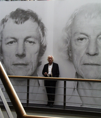
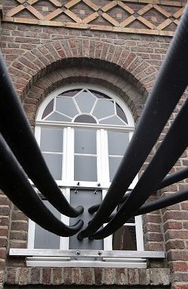
Christian Tedeschi


- says Christian Tedeschi. And it is true of his works: at first glance they seem scary, dangerous, aggressive. But once we look more carefully, we see a light-heartedness that enchants. For once, the heavy matter turns into crystal form. For once, Beuys is misundertood as he should be, without the huffing and puffing of someone too old to be a disciple. And so, the matter dances and plays. It swirls in the air as if it weren't suspended. It moves by itself. But don't be fooled - it does nothing of itself. Even if it takes 10 seconds to reorganize it, the world stands anew. Enthropy? Erosion? A gentle spin of time?
I believe in art that one trips over,
Tumbles blindly
Down several flights of stairs
To end up on their own two feet.
Virtually unscathed, and
Into the arms of their sweetheart.
Technorati:
A Glimpse of Infinity?

Camera Obscura 2005/1-Inf is a worldwide project in which two holes of a twin-holed pinhole camera are being auctioned simultaneously on Ebay every week. This project is dedicated to the polish artist Roman Opalka and his work 1965/1-∞. The highest bidders in each case receive one after the other a pinhole camera loaded with a piece of unexposed sheet of 5x7 Inch b/w film.There is a sense of global fraternity and timelessness in this project that's appealing. Opałka is a great reference to have - he is an artist I have come to appreciate and there is much to learn from him. One of the things is persistence. Another is discipline. Yet another, choosing the right format. If you get your format right, the work works with you, if not for you.
I'm not convinced that the authors, Przemek Zajfert and Burkhard Walther, figured out the format right. Not that it's bad - it works, and the kaleidoscope of scenes actually starts to develop. The actual photos must be immensely more interesting, with details we can barely figure out or imagine on the net (the quality of the posted pics could be better!). Still, that's just one part of the picture. Another is the question of, well, infinity. Of time. Or rhythm. Or a key of some sort. In this case, there is none. Time is gone, there is no development, and the pictures represent - whatever someone wants them to, plus the usual pinhole surprize. And that's a pity. One could easily imagine a slightly more disciplined version, with a "theme", or some rules that would create a more coherent whole. Otherwise the risk is getting simply too creative.
(Below - images of Opałka's work.)


Technorati:
Wednesday, April 19, 2006
Cattelan's perverted victory


Of course, it's not his fault. He simply made the art. And if someone interpreted it wrong, well, they interpreted it wrong.
As many of you know, in 2004 the Italian sculptor Maurizio Cattelan hung three plastic dolls of children from Milan's oldest tree.
Shortly after being officially "open", the exhibition came to a sudden end: Franco De Benedetto, a Milenese man, decided to cut the children off. He cut two ropes, but swayed and fell when cutting the third one. He was injured and taken to hospital.
Cattelan graciously didn't press charges, but the city of Milan did. And won. De Benedetto will be spending three months in prison for destroying a work of art. Mind you, it took them nearly two years to establish this was indeed a work of art, as that was the prosecution's main argument.
Some say he simply misinterpreted the nature of the work:
Maybe, as the ambulance blared through the Milan streets, di Benedetto was moved to reflect on the violent collision of two types of judgment: civic and aesthetic. He seemed to have mistaken one for the other; or rather, he’d disallowed the second as soon as he set out on his hapless clamber.I quite disagree. I think the whole work was based on the game between a work of art and a "natural" surrounding. As it is often the case with Cattelan, it was supposed to create uncertainty about the exact role of the work. Only here, it could easily bring uncertainty as to whether the sculptures were real or not.
In places where guns are illegal it is also a crime to pretend one has a gun. Even if you said it was a work of art, you would still be inciting a certain type of behaviour, suggesting a certain reality. I believe this is exactly the case here. This is not to say Cattelan is a criminal, case closed. Not at all. But since he plays in the real world, he should accept the real world's rules. And he does - by neither accusing De Benedetto formally, nor insisting on hanging the children again. But he creates a situation and then washes his hands, as if he wasn't its author. De Benedetto hurt himself and wound up in the hospital. This should be enough. The contact between art and reality is made quite explicit in this fall. The score seems so naturally set. Why go further?

Technorati:
Monday, April 17, 2006
3 pics of people by Ron Mueck

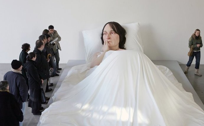
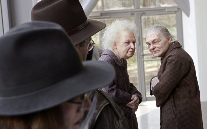 What I like in Ron Mueck's work is not so much the "life-likeness" of the figures (that has been done and re-done). It is their dramatic character, their theatricality. They have their stories, personalities, they are not types of people (like Duane Hanson's characters often were).
The pictures come from the Washington Post and have an added value: they create stories between the sculptures and the onlookers. This performative play, this superimposed dialogue, is a blessing - it takes our attention off the "look how real it looks" aspect and shows another level in the naturalistic technique.
Technorati:
Writing down the dance
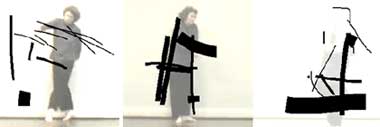
The history of contemporary dance knows many attempts at pinning down the choreographic composition. None of them is perfect though - and the main flaw is that they are mainly character-based, i.e., they create signs to represent movements. This semiotic approach has obvious limitations - the purity of movement, its dynamic and time is gone. Also, it takes a long time for someone to understand how a system works, so as to repeat it, or even read it correctly.
Simply recording on video also isn't enough, as it lacks all the advantages of symbolic transcription: yes, you can see what's happening, but how are you to explain it? How are you to know if what you're doing is the same? It all requires quite a lot of imagination, and one usually ends up confused and unable to really "get the real thing".
So how is a choreographer to mark down what he's come up with?
Here is a new, pretty solution:
ps: Following the comment that "this has been done before. done a lot":Yes, it has. Using software to work with choreography has an entire history, that goes back at least to the great Merce Cunningham's 1989 performance with the program Life Forms. There were - and are - many other choreographers and programmers that followed. I'm not specialist on the matter - read more about it here and here and here. (Some examples of software are Isadora, the Choreograph, the Chaographer and the Interactive Choreographic Sketchbook). However, what seems to me particularly appealing about the Rotosketch is a combination of factors: 1) the possibility of including time as one of the variables in the sketch; 2) the "photoshop" characterisics that make it easy and intuitive (just use the pen and pad...); 3) the availability of the software (free download on the net); 4) the possibility of playing between the level of choreography and drawing. As you can see on the video, the sketch is really an interpretation of the draughtsman/analyst, allowing for a more personal, less software-dependent approach.
(via)
Simply recording on video also isn't enough, as it lacks all the advantages of symbolic transcription: yes, you can see what's happening, but how are you to explain it? How are you to know if what you're doing is the same? It all requires quite a lot of imagination, and one usually ends up confused and unable to really "get the real thing".
So how is a choreographer to mark down what he's come up with?
Here is a new, pretty solution:
Rotosketch is an intuitive tool for sketching, doodling and notating on top of video, such that the marks that are made are linked in time with the video. This allows the user to draw strokes along the the axis of time, as well as the normal x and y axes, and for those strokes to augment, analyze, interpret, or even obliterate a video sequence.
ps: Following the comment that "this has been done before. done a lot":Yes, it has. Using software to work with choreography has an entire history, that goes back at least to the great Merce Cunningham's 1989 performance with the program Life Forms. There were - and are - many other choreographers and programmers that followed. I'm not specialist on the matter - read more about it here and here and here. (Some examples of software are Isadora, the Choreograph, the Chaographer and the Interactive Choreographic Sketchbook). However, what seems to me particularly appealing about the Rotosketch is a combination of factors: 1) the possibility of including time as one of the variables in the sketch; 2) the "photoshop" characterisics that make it easy and intuitive (just use the pen and pad...); 3) the availability of the software (free download on the net); 4) the possibility of playing between the level of choreography and drawing. As you can see on the video, the sketch is really an interpretation of the draughtsman/analyst, allowing for a more personal, less software-dependent approach.
(via)
Technorati:
Saturday, April 15, 2006


Wednesday, April 12, 2006
Oscar Guzman: the surface of dreams
 It is not quite as the artist, Oscar Guzman, would have it - those images are not photos. We can hardly say they have "characteristics of a photographic record", as the author puts it. They are clearly painted, in a style resembling some computer games. But that's where similarities stop.
I remember playing a flight simulator with my brother some years ago. We ignored the supposed objective of the game and simply kept flying around, enjoying the view. That is how I feel watching these wonderful city landscapes - as if I discovered another way, another level.
It is clearly the level of dreams. The architecture of dreams (hence some echoes of surrealism). The urban dream life. But it doesn't let me dive into it. And that's where the photo analogy becomes useful: here, I stay on the surface. I have evidence that this world exists, but nothing beyond that. These blurred figures are all I'll ever get - they are pictures of a lost civilization. And the association with computer games/graphics makes the civilization a truly unexpected discovery.
 PS.: I have just one objection. I would rather not see the focused faces on some of the pictures. They refer me to a particular region, culture, part of the world. I think it's a pity, and not necessary to make our grey cells work.
(via)
Technorati:
Monday, April 10, 2006
Ad
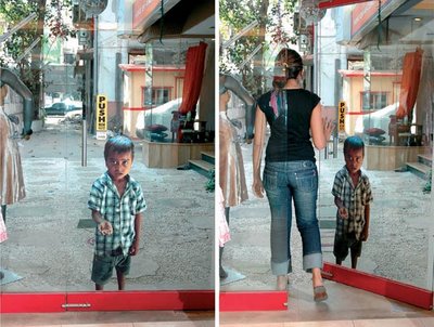
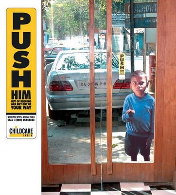
"The effort for Childcare, India aims to help more than 20 Million Indian Children who beg on the streets each day."
Found this powerful ad on a very entertaining site for ad-lovers. It has some brilliant ideas. Fascinating, how the world of advertizing is close to the artworld, without either of the sides openly acknowledging the brotherhood. With a few notable exceptions, of course.
(via)
A pic and a quote
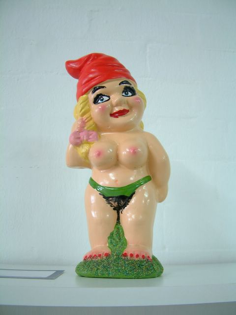 Adam Cullen and Cash Brown, Garden Slut
You might need to cross the Polish-German border a couple of times (filled with tens of brothels and thousands of garden dwarves for sale) to enjoy it as much as I do.
Oh, and the quote has nothing (?) to do with the pic:
“Politics is an embarrassment in much contemporary art – an exercise in selling prepackaged opinions to the converted” - art critic John McDonald
But if you still believe it does make a difference, and have been trying to think how the vectors of influence might work, read this recent discussion.
I stole both the pic and the quote at this too art-smart site.
Technorati:
Saturday, April 08, 2006
Friday, April 07, 2006
The Berardo Collection
 Wim Delvoye, Betonmolen (Cement Mixer) (1992)
 Margaret Wharton, Chair (1980)
 Ernesto Neto, Body Object (1999)
 Allan D'Arcangelo, Smoke Dream (1963)
 Antony Gormley, Bearing (1993)
I've seen a part of it on exhibition, some two years ago, in Sintra near Lisbon. I couldn't believe my eyes. The Berardo Collection made a big impression even on my dull and ignorant senses (yes, I firmly believe ignorance dulls the senses). What were these masterpieces doing in a tiny, tourist-oriented town? Of course, Sintra's history is associated with artists (I believe Byron called it "paradise on Earth"), but let's be honest - this stopped about a century ago. And if there is one thing few visitors care about, it's going to see a contemporary art exhibit. Fortunately, the Museum of Modern Art didn't seem to mind, and has been showing a part of the Berardo Collection for several years now. The problem was - the Museum was really no match for this very large (4000 pieces) and diversified (besides modern art, it has notably an impressive poster collection, as well as porcelain, coin and book collections) set. It was too small, and, frankly, simply not quite "cosmopolitan" enough. At least in a country with such a deficit in the appreciation of contemporary art.
The talks with the various Portuguese governments were endless. When I arrived here nearly 4 years ago, there was already talk of a total failure. Through this time, I heard close to nothing of the collection. I know that José Berardo, the businessman who created the collection, got really tired, and mentioned several alternative countries willing to host the collection (France, Italy, U.S.). And now this: the Portuguese government (whose minister of culture has been under great attack of the artistic milieu) has finally made a deal with Berardo. It will be exhibited at the highly prestigious Belém Cultural Center (which is the best place in Portugal culture-wise).
The Berardo Collection is exciting for similar reasons the Gulbenkian Museum is - it was created by a single art-lover with a great sensibility* and significantly too much money. As was the case with Gulbenkian, Berardo opted not to buy the most renowned (expensive) works, but to try and find less known ones with first-rate quality. This makes it somehow less attractive to the average museum-goer or art amateur, and I must admit there were many works by artists I was interested in that I found difficult to digest. On the other hand, when I knew some artist slightly better (or even are more used to a certain language), the work you find (most of the artists are represented by a single work - it's what is called in agriculture and extensive, not an intensive culture) really made my day.
You can see all the works from the modern art collection at the Berardo site (the site isn't the best I've seen, and the "artist movements" sometimes are simply ridiculous - e.g. "postmodernism" (?) and "experimental art" (?) as two separate movements). You'll notice how extensive the spectrum of works is. For me, there is one thing missing though: work from outside the comfortable, Euro-American tradition. There is modern art, contemporary art. Very little really new art though. And very little, for instance, from Central and Eastern Europe (haven't found anything so far!). Of course, art is also a business as any other. New art is a gamble. But the choices (see, for instance, the poster collection, from what I saw 100% American) sometimes seem more related to a certain lack of wider perspective. (Can someone contradict me, please?) Maybe now, when the new museum opens with a year budget of 1 million euro, things will evolve? After all, only 50% of the money will come from Berardo. The other 50% is from the state - and spending state money should be easier, I suppose.
* Apparently Berardo has mainly a sensibility for choosing the right person, as he himself is said to be quite far from having a profound knowledge of art. The person I was told stands behind the class of the collection is Francisco Capelo, himself a great design collector (the great permanent exhibition of the Museum of Design are his adopted babies).
Technorati:
Thursday, April 06, 2006
Space Invaders

I completely forgot about them. Space Invaders. Are they the cutest thing? Or are they simply a street-art version of Nike? A proof that the "alternative" world is also easy to manipulate into "fun symbols"? Or are they simply fun?
Technorati:
Wednesday, April 05, 2006
Tags/ Categories
I'm fighting hard to get some sort of categories or tags working in here. So far, without any true success, but I haven't given up. BTW, if anyone has any solutions, HELP.
Tuesday, April 04, 2006
Designing better, for a better world
Today, two stories of people deciding to make a difference - and create something beautiful while they're at it.
The first one is the story of a man that lived the American dream until it bored him to death. And he decided to do something good. And he invented a shelter that is something between a tent and a house, fairly inexpensive, pretty, clean, and above all - resistent. Sanford Ponder, who used to work as a manager in Microsoft, created The Pod, which looks like some sci-fi object, and is, well, this:
 The beginning of something beautiful?
You need to see the video to get the whole story (a little cheesy, but interesting), and there is a follow-up - this story about the first humanitarian attempt, in Pakistan, and an update.
While the above project was created by someone who was only an amateur designer, professional designers and architects can also have sudden awakenings. Here is the story of Cameron Sinclair, a young architect who discovered he can be just as good an architect while being a better man. Today, he creates a range of projects, from shelters for the homeless to a mobile HIV clinic, etc. etc.

The interview with him is here, here is his Architecture for Humanity. And for more artistic ways of changing the world, see www.worldchanging.com.

The first one is the story of a man that lived the American dream until it bored him to death. And he decided to do something good. And he invented a shelter that is something between a tent and a house, fairly inexpensive, pretty, clean, and above all - resistent. Sanford Ponder, who used to work as a manager in Microsoft, created The Pod, which looks like some sci-fi object, and is, well, this:
The beginning of something beautiful?
You need to see the video to get the whole story (a little cheesy, but interesting), and there is a follow-up - this story about the first humanitarian attempt, in Pakistan, and an update.
While the above project was created by someone who was only an amateur designer, professional designers and architects can also have sudden awakenings. Here is the story of Cameron Sinclair, a young architect who discovered he can be just as good an architect while being a better man. Today, he creates a range of projects, from shelters for the homeless to a mobile HIV clinic, etc. etc.
The interview with him is here, here is his Architecture for Humanity. And for more artistic ways of changing the world, see www.worldchanging.com.
Technorati:

Sunday, April 02, 2006
245 Cubic Meters of controversy - Santiago Sierra's latest
How could I have missed this!
Santiago Sierra is back. And, as usual, he's creating a stir. If it seemed to you he's been controversial enough, paying people to be tattooed or to carry stone squares around or to stay walled in during an exhibition, well, this time he seems to have outdone himself.
His project, called 245 Cubic Meters, was
to give people a sense of the Holocaust by pumping lethal car exhaust fumes into a former synagogue and letting visitors enter one by one with a breathing apparatus.I suppose everything worked out as planned: huge outrage, criticism, and a public debate about art, it's possible role in society and the way it can, should or does influence us.
The exhibition was suspended.
Here is my take on it.
1. I don't agree with the critics that claim Sierra's work is exactly what it claims to fight, i.e., "the trivialization of the Holocaust", as the artist put it. I don't think something becomes trivial just because you make a direct reference to it. Obviously, this isn't Disneyland, and nobody going in there must have made it light-heartedly. This is a very serious, heavy matter. When death is near, it is really too simple to discard it as "trivial".
 2. Taking place in Germany, the work can be seen as a cleansing ritual, more than a gesture of rememberance. Many Germans I know never dared to ask their fathers or granfathers what they did during the war (Hans in his note to my last post notes the ever-present figure of the goo-bad uncle).
3. Part of the cleansing is certainly the aethetic aspect of the work. Walking in an abandoned synagogue is a strong emotion. Walking with a firefighter-guide makes it even more surreal.
4. The firefighter is a very strong element. It was misinterpreted by several commentators as the proof of how ridiculous an attempt at restaging the drama can be. Well, I think it rather shows that this is not a restaging. This is a work of art, and is to be treated as such. It tells a story which goes beyond itself. It is not about reliving the moment. It is, maybe, about the possibility of reliving the moment. About the power of a place. Authenticity - yes. But authenticity of a place, of a history, of an event. Authenticity of a gas and of our reaction to it. Of the precautions we take. Today.
5. If Sierra was actually after the creepy feeling that all this was real, if he wanted to "remember", he could have simply made a trip to Auschwitz. It is a horrible, horrible place. I'm still not sure if I think it is a good thing for it to exist. Its struggle for memory gets scarily close to a fascination with death, the same one that makes us look at an accident or listen to a horrible story. Yes, it makes us remember. But I'm not sure if the cost is not, well, some sort of a pornography, if you may, an indecent exposure of something that really should have been put to rest. Nonetheless, it exists - it's there to see for anyone unsure if his memory is correct, unsure if he has enough disgust for what people can do to other people. I don't think we need Santiago Sierra to remind us of that.
6. The difference is that Sierra made his piece in a gallery space. In a synagogue. In Germany. I am really tired of having Poland associated with the Holocaust (I think I mentioned it some while ago). This work puts the finger to the wound. Right where it (still!) hurts.
7. How pretentious to seek to evoke their horror and fear of death in such a cheap way! In a cynical game which yields no insight whatsoever. - says a newspaper.
For some time, Santiago Sierra has been asking one question: "What if it were you?". His works are exercices in empathy. They are often cruel exercices. In this sense, yes, they get cynical.
This reminds me of the famous Stanley Milgram, a scientist often accused of cynicism, who discovered that most people can be unhumanly cruel by creating simple conditions (orders coming from an authority) that made them do what they thought to be acts of great cruelty. Milgram was accused of turning people into murderers, as if they were toys to play with. Sierra is accused of "hurting the dignity of the victims", as if they were toys to play with. I really don't see how the dignity of the victims is being hurt. And, contrary to some of his other works, here Sierra doesn't actually use anyone, he doesn't turn people into something just (?) for art's sake.
8. What he does play with is memory. And guilt. The synagogue is the sign, it is what made the difference when the selection was made during the war, it was what identified the victims and what differenciated them from the others (the killers, but also the by-standers). Here, the visitor becomes at once the victim, the perpetrator and the by-stander, the observer. Being the art spectator he is, he cannot help but have a distance. At the same time, he goes inside, he participates. He repeats history. As a victim, or as a re-creator?
9. To me, this last question is going too far. And not because it crosses some line of decency. Because from what I can imagine and see on the pictures (once again: what can I imagine and see on the picture? how far can imagination get me?), the conceptuality of the work is simply unbearable. Bluntly speaking: it seems boring. It is the second work by Sierra that I find interesting as a concept, but have difficulty finding strong as an actual work (The first one was 300 tons). I really don't feel like walking through an empty synagogue with a fireman just so Santiago Sierra can make his point. And having a gas mask on would hardly change my stance.
But honestly, I think I still haven't figured it all out quite yet.

Technorati:
Saturday, April 01, 2006
By popular demand

Since the Richter quote seemed to bring some interesting questions (thanks Theo and Hans! I knew I could count on you!), here is some more fuel...
"pure painting is inanity, and a line is interesting only if it arouses interesting associations"


"The Photo Pictures [a series of photo-realistic paintings by Richter - Vv]: taking what is there, because one's own epxeriences only make things worse."
 "Using chance is like painting Nature - but which chance event, out of all the countless possibilities?"
and finally, an apparently trivial one that I like a lot. Concerning an exhibition:
"The one thing that frightens me is that I might paint just as badly."
Technorati:
Subscribe to:
Posts (Atom)