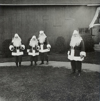
 Bloodshedding pieces of black-and-white happiness.
The unfair balance of the picture.
 The wider picture. The bloody wider picture always giving it the color that wasn't there in the first place.
Notice: the wider picture is never the first place. It comes as we back up, until we are nowhere to be found, impressed by the relation of the Thing with that wide horizon, that swift encompassing of the Other into the Thing.
 The unfair balance of the picture. Nothing should ever be framed. Frames should be prohibited, forcing us into oblivion, into focusing on the End nearest us. Who knows how many Santa Clauses are necessary?
 The unfair balance of the picture.
The pictures are by, in order of appearance, Diane Arbus, Mikołaj Chylak, Diane Arbus, Fischli & Weiss.

5 comments:
...black-and-white happiness...
I like the first picture..XOX
I just got this link:
http://www.oliverbaron.com/olikunst.html
crazy
bernie
Yeah I like the first picture aswel, didn't see a post comment spot though.. So I'll place it here! I like the pictures from the gugenheim museum, but what do they represent?
very nice work!
I love this post about balance in photographs. My favorite is the Santa Claus picture. It's always important to point out that balance does not necessarily mean symmetry, but instead equally placing your points of interest. Great post.
-Art Monster
theartmonster.blogspot.com
Love the Santa's. Very inspiring.
Post a Comment