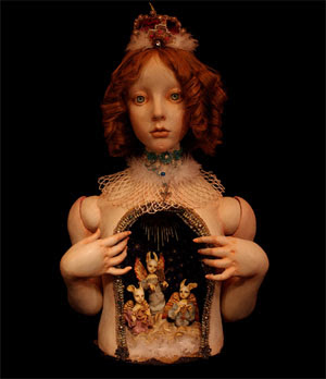
Here we are, now, entertain us.
In a comment to my last post, Matka wrote:
Please, add a new piece soon! My internet explorer opens with your page and this work makes me seek [sick?] for a couple of hours.Independent on whether this particular request should be executed or not, a serious issue creeps up behind: can we speak of a more or less
bloggable material? Should we?
At first, there seems to be no doubt: a blog is personal by definition, right? The author decides what to put on it, and that's it?
Not quite.
1) Any reader of art blogs will notice
blogs have formulas and tend to stick to them (this is not just the case of art blogs, obviously). So there is a topic, an approach, a way of writing and really, a "strategy". This can be a personal strategy, but it remains one.
2) In the case of art blogs,
strong images work. That is, if you're looking for an audience, don't spend so much time writing: find attractive images. They can be shocking, but they have to be instantly rewarding for the spectator. And
that's disgusting, dear Matka.
There's the rub: A blog is like a light version of a magazine. You drop by, take a glance, and in case of picture-filled blogs, if the image is not appealing, you move along. I see it in the stats, I know it (mea culpa) from autopsy. An art blog is, to a great extent, a mini-gallery. To a neophyte observer it might seem like people only take a glance and then leave. But after all, isn't it about those few that stay a while and dwelve deeper?
It's nice to be visited. And appreciated. And the more popular you are, the more, humm, popular you are.
The point is, it influences the choices you make. And all of a sudden, you
know what sort of images
work on the blog. And those are the ones you choose. Fast art consumption. It's nice, it's clean, we get it. Good,
effective art.
Then the next step might be thinking about not offending Matka's tastes. And that's scary if you write a blog, (a
personal page). But then, even if you don't go that far, the blog, the site, gains a life of its own. And thenyou start listening in on what
it wants.
Come to think of it, it's not necessarily horrible. After all, it's also the wonderful feeling of an object coming to life, gaining an identity. Indeed, in the case of this blog this life has been continuing even during my absences. And that's a beautiful sight.
Yet it is still mine. Heheh...
And hopefuly, the lapse in Matka's text did make sense: beyond making her
sick, the image also makes her
seek for a couple of hours.
And in case it doesn't, here are a couple of replacement images.
If anyone here can handle Japanese, please go here or here and let me know who is the artist, and what is going on, these sites seem creepy as hell... O, that this too too solid flesh would melt Thaw and resolve itself into a dew!

 Found at Rebel:art among other (excellent) participants of the International Sticker Awards (to be announced on October 3) is this wonderful example of product sabotage, by Thomas Judisch. The sticker simply says "free sample". You can agree with the ideaology or not, but you have to admit it's ingenious to say the least.


